
Creating An Interactive Skills Chart with The Plotly Library
Using little python code plotly allows you to create full featured interactive graphs. Using my own data for skills I have used during my years in Tech.
The Why?
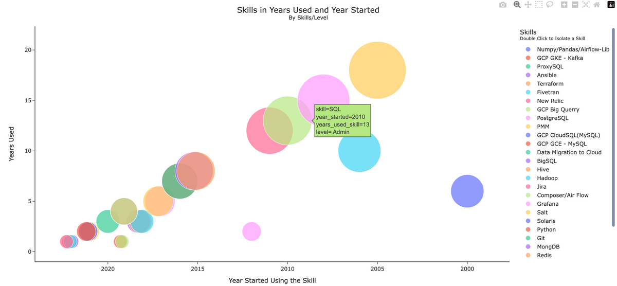
I wanted to take a stab at creating a chart showing my skills, the level of usage, and the number of years I have used the skill in a visualization. The data in this is not a complete list of my skills, but I have created a quick CSV file with a list of skills, the year I started using them, and the year I stopped using them (2023 being the current year). The size of the bubbles indicates the amount of years I have used the skill.
The Introduction to the solution:
Lets get to know plotly first if you have never met. Python's Plotly module is a powerful tool for creating interactive plots. With just a few lines of code, you can create a plot with customizable axes, markers, and colors. The scatter plot which I use here also allows you to easily add trend lines, error bars, and other annotations to your plot.
Sample Data:
An example of the CSV file.
SQL,    2010,          2023, Admin
Python, 2016,          2023, Scripts/Dags/Frameworks
MySQL,  2011,          2023, Admin/Built/on-prem/cloud
MongDB, 2015.2,           2023.2, Admin/Built/on-prem/Cloud
Redis,  2015.1,           2023.1, Admin/Built
Using the following columns:
'skill', 'year_started','year_used', 'level'Transforming the Data:
I had to do some simple steps to transform the data for the scatter plot I chose. In the python script I took the year I stopped and minus the year I started to get the size of the bubbles in the scatter plot.
I needed to add a new column that I used for the size of Skill bubbles. The new column I called years_used_skill.
df['years_used_skill'] = df['year_used'] - df['year_started']
Example Data Frame Output:
| skill | year_started | year_used | level | years_used_skill |
|---|---|---|---|---|
| Linux | 2005.0 | 2023.0 | Admin/User/Built | 18.0 |
| Confluence | 2008.0 | 2023.0 | User / Documentation Creator | 15.0 |
| SQL | 2010.0 | 2023.0 | Admin | 13.0 |
I took the year I stopped using the skill minus the year I started to get the size of the dots in the scatter plot. The default of the bubbles were generally small. You can fix that so it's eassier to view if your values are smaller then 40. Since the size were base off of years used in the skill I set the default size higher. You can change the max size of the bubbles using the parameter size_max=80 in the scatter plot.
I also wanted the most recent skills to show first from right to left which is as easy as using autorange="reversed" fig.update_xaxes(autorange="reversed").
To change the order of the legend you need to do the following:
skills = df.sort_values(by='years_used_skill',ascending=True,\
ignore_index=True)
Customizing the Chart:
You have many options to customize your charts under fig.update_layout():.
fig.update_layout(
    title="Skills in Years Used and Year Started<br><sup>By Skills/Level</sup>",
    title_x=0.5,
    xaxis_title="Year Started Using the Skill",
    yaxis_title="Years Used",
    legend_title="Skills <br><sup>Double Click to Isolate a Skill</sup>",
    template="simple_white",
)
You can use multiple templates for plotly charts. I used simple_white. Here are a few others.
template="simple_white"
template="plotly_white"
template="plotly_dark"
template="ggplot2"
template="seaborn"
template="none"
You can also add annotations under:
annotations=[
    {
        "text": "Database Engineer Lead",
        "x": 2021,
        "y": 55,
    },
    {
        "text": "Cloud Enablement Team",
        "x": 2019,
        "y": 45,
    },
    {
        "text": "Hadoop Administration",
        "x": 2017,
        "y": 35,
    },
You can move the legend:
    legend=dict(
        x=0.0001,
        y=-1.999,
        yanchor="bottom",
        tracegroupgap=1.2
    ),
For a live example graph of the following code above you can view the outcome here:
 Michael R Blue
For a cleaner demo I left out annotations below.
Run the script:
$ python3 skills_graph
This will launch a the graph in a browser on your localhost.
You can view the source of that page and use the code into any webserver page.
Interactive Chart Example:
You can use your mouse to drill down or click on the legend for skill you would want the data for.
Note: On mobile phone the chart autoscales and the legend takes over the actual graph but I feel the legend is needed.
Code Example:
Here is the python code to create the graph.
'''
Skill Graph using Plotly
'''

import pandas as pd
import plotly.express as px

# creating the datafrome from the csv file I created
df = pd.read_csv('data/csv/skill.csv',\
    names=['skill', 'year_started','year_used', 'level'], index_col=False)

'''
Adding new column and calculating
the years used for each skill to the df.
This used for the size of the dots
'''

df['years_used_skill'] = df['year_used'] - df['year_started']

# order by the new column
skills = df.sort_values(by='years_used_skill',\
    ascending=True, ignore_index=True)

# show dataframe
print(skills.to_string(index=False))

# create scatter plot
fig = px.scatter(
    skills,
    x="year_started",
    y="years_used_skill",
    color="skill",
    size="years_used_skill",
    size_max=80,
    hover_data=["level"],
)

# reverse the dates start from 2023
fig.update_xaxes(autorange="reversed")

# create labels and show plot
fig.update_layout(
    title="Skills in Years Used and Year Started<br><sup>By Skills/Level</sup>",
    title_x=0.5,
    xaxis_title="Year Started Using the Skill",
    yaxis_title="Years Used",
    legend_title="Skills <br><sup>Double Click to Isolate a Skill</sup>",
    template="simple_white",
)

fig.show()